Transformers and More @ The Seibertron Store


Transformers Regeneration One #93
Simon Furman (w) • Guido Guidi (a) • Andrew Wildman, Guidi (c)
BATTLETIDE! Opposing factions and forces meet head on, as the battle for
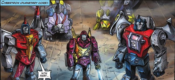
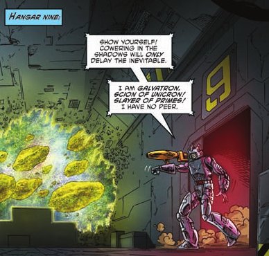
Cybertron (and indeed the future) begins in earnest. BLUDGEON, SOUNDWAVE, GALVATRON, STARSCREAM, and—caught in the middle—the Autobots, most crucially their greatest warrior ULTRA MAGNUS! And HOT ROD meets his maker. Literally.
*2 regular covers will be shipped in a 1-to-1 ratio
FC • 32 pages • $3.99
*Variant Covers:
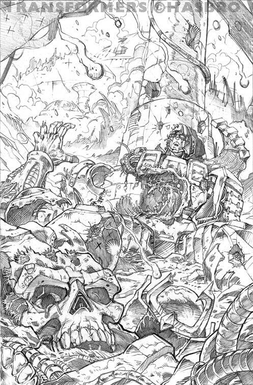
Geoff Senior variant cover!
Bullet points:
• Shock follows shock as total catastrophe looms large!
• The entire universe holds its collective breath!
SCRIPT (W)RAP – REGENERATION ONE #93
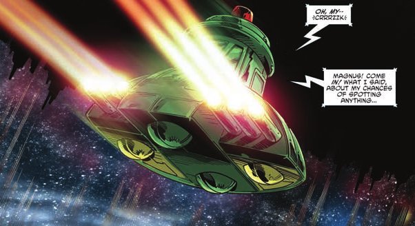
While not exactly all change, change is in the air as Transformers: Regeneration One #93 hits the stands (Wednesday July 17th to be exact). And I’m not just talking about the change of artist! But, before I delve into another post-script ramble/tease, as is my wont, it’s time to welcome aboard (pencil) artist Guido Guidi. Of course, Guido’s no stranger to either Transformers or Regeneration One (having worked extensively for both Dreamwave and IDW on their TF titles and supplied the variant ‘B’ covers for RG1), but it’s some consolation for the loss of Andrew (no, he’s not dead, just busy — in a kind of flat out, full time way — on an upcoming kids’ animated TV show) that we gain Guido’s amazing and detailed pencils. Guido really hits the ground running with #93, affecting a seamless transition (aided and abetted by the inks of Stephen Baskerville and the colours of John-Paul Bove). Trust me, this and the next few issues are gonna knock your socks off and shatter trousers in trans-continental style. And Andrew’s with us for the duration in one form or another, continuing as ‘A’ cover artist and returning for #100 to see us out in fitting style. Right, onwards with the issue itself. As usual, spoiler alert, first. My intention is always more to tease than reveal, but if you’d rather delve in stone cold, cease reading now. Okay, so, #93, phew, what a packed issue. With both Galvatron and Bludgeon on the last legs of their respective journeys to Cybertron, with starkly different agendas (which we delve more into here), matters build to a pre-invasion head. For a start, there’s a rather disgruntled Starscream, the not-as-helpless-as-he-appears fellow traveller aboard the Ark. Voice back – check. Attitude back – check. Need for payback back – check. Galvatron is in for a rude awakening! And then there’s Bludgeon. Having allied himself with Soundwave, you’d think it was a simple matter of conquest on his mind. Not so. There’s a far darker agenda simmering behind that skull face. One that we peel back and reveal this issue. It’s a shocker and a portend of things to come. Plus, Wreckers action, Dinobot action and Primus action. Yep, Primus! But… he’s gone, isn’t he? Deceased? An ex-god? Well… Remember I mentioned that change was in the air. It’s coming for Hot Rod… in a big way… and it begins right here. All i can say is… hoo boy! You can check out the official IDW preview here.
Fires_Of_Inferno wrote:I seriously can not help but point out that Galvatron's shadow isn't being cast on Ultra Magnus who's own shadow isn't being cast on the ground.





 ½ out of


Return to Transformers Cartoons and Comics Forum
Registered users: Bing [Bot], Google [Bot], Google Adsense [Bot], Roadbuster, UltOrange


