Good morrow, fellow Transformers fans! Here at Seibertron.com we strive to bring you interesting, enthusiastic original content as well as the best news and toy galleries in the fandom. To that end, we went and checked in with the authors of this week's IDW Publishing release of Transformers: Legacy - The Art of Transformers Packaging: Bill Forster and Jim 'Lockwind' Sorenson! We had a chat with Sorenson already during the
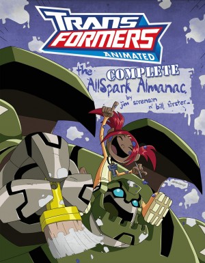
Twincast Podcast #100, but read on below for more juicy information about this incredible book, clocking in at 300 pages and for the measly price of $49.99. And we also happen to chat about the upcoming release of the
Complete AllSpark Almanac, so make sure to read all the way!
Va'al – Bill, Jim, it is an incredible pleasure to be talking to both of you. The book looks incredible. Truly. I was a late collector, and grew up in Europe, so some of this is vaguely new to me! But incredible, still. And congratulations on seeing this project all the way through to publication, it must've taken years (and your Acknowledgements section confirms it). How long did it take?
Bill Forster – Thank you! I can share some of the feeling: Jim was the one finding the images and sending them over, it was really exciting for me too. The idea for the book was something that came to our minds since the Ark books. So the answer would probably be...
Jim Sorenson – Probably officially in 2006. But we pitched the idea before the second ark book, and we were talking to some Hasbro guys at the tour during BotCon 2007, only to find out they didn't really have any artwork available.
Then Andrew Hall (aka Hydra), who helped with the Ark 2, went to work for Part One, Takara's design firm, and dug into their archives. He discovered they had a ton of the material, so we thought the time had come to resubmitted the idea to IDW. We had good 40% of the material from Part One.
We also worked with Rik Alvarez at Hasbro, who found some more pieces, maybe another 10%, including some of the more unusual, unreleased paintings that show up in the book. But the biggest source of material were fans themselves, who came to help after a good beating of the drums on my part.
In fact, the initial intention was to have a smattering of pieces across the toy lines, rather than something more comprehensive, but what we've eventually achieved is almost the entirety for what was in scope. That's G1 and G2 in the US, and G1 for Japan. The Japanese G2 art we shied away from, as it was CG and the style didn't really mesh, but you can get a hint of that style because we used a Japanese CG mural as the chapter header for the G2 chapter. That choice was because they never made an airbrushed one. But still, for the eras we covered, we have maybe 90-95% of the art.
Va'al – That is really an impressive feat! And how did you go about dividing up the book into its chapters? Had you considered something by theme, before moving to series?
Bill – Well, we didn't want the same sort of background running through, we wanted to show how it changes, show the visual differences from one line to the next. So we decided to go for the different periods and toy gimmicks, and adding the purple and red backgrounds for the two Autobot and Decepticon factions.
Jim – We really wanted to impart a sense of momentum as you read the books. The Ark books work as reference, but didn't have a sense of progression. It's great for hardcore transformers fans, especially if you want to use it as a visual reference. If you look, you can see that we structued the book that way. We even have a by-character index in the back. However, for a more casual reader, we've seen them go through it and usually they spend a lot of time on the first few images but then accellerate as they go, so that they're just skimming over the last 100 pages or so looking for something different! The Almanacs already improved on that, and I think Bill has done a great job here with Legacy at giving a sense of dynamic progression, pulling the reader through the art.
Va'al – I would agree, I tried to just dip in, but ended up going from start to finish! So how did you divide the work between the two of you, what were your roles for the book?
Bill – Generally, Jim handles the writing, I do the art direction. But we both dabble in each other's worlds, and we get to do different things. In this one though, Jim was definitely the curator, and I the art director: he'd get the thematic display and progression where he wanted them, I'd then lay them out and show them off accordingly.
Jim – Yes, I find the pieces and organize them. Say, for example, with the Stunticons: I wanted them all in one section, or maybe the guys on one page and Menasor on another. It was then up to Bill to arrange them how they looked best, with that basic structurein mind. And he did so much work. We had great quality images, but Bill still had to do a gigantic amount of work cleaning them and cutting them out of their backgrounds.
Bill – I actually got nerve damage from the work, I had to use a mouse rather than a tablet and it messed up my hand quite bad!
Va'al - Whoah! That makes it even more impressive, sorry to hear about it though!
Bill - Another factor was that Jim had moved to Albuquerque, so it made sense to divide up the work.
Jim – But also, Legacy was much more difficult than other books we've worked on, and we each had to work on our own strengths. Bill's is visual, the flow, the backgrounds. I've gone from awful to professionally competent in that area, but Bill is beyond competent, he's exceptional. I bring a strong sense of context and a network of contacts to the job. I flew over to Japan, to different US cities to collect material. Not that he couldn't! He did it once or twice.
Bill – Yeah, with Action Master Shockwave. But Jim is the driving force, getting on planes, contacting people. I sit at a table and put it all painstakingly together.
Jim – Bill's name is first on this one, in the credits, and it really is reflective of the work that went into the project. This is an art book, a beautiful art book. It's playing to his strengths.
Bill – I thought it was alphabetical! Just kidding. I think it was really important to deliver something that would really visually strike the readers and fans.
Va'al – The visual element certainly does jump out! You mention throughout that a lot of the art shows off the 'transforming' nature of the characters, the movement. Take the Triggerbots and Triggercons for example.. you actually see the spring loaded weapons.
Jim – Oh yeah, remember those? They were a pain.
Bill – Yeah. I had no idea what to do about the background, how to show the motion lines.. I winged it in the end. I replicated the images, trying to figure out how to drop a background. It took forever to reconstruct them over the originals. I was sitting there for a day and a half for each image. At least there weren't too many of them!
With the Pretenders, who also have some motion, they also had a half fade from black to white in the backgrounds. I was originally going to do a grid background, but then the images didn't pop right. In the end, I just went for black background to show off the artwork.
Jim – It's probably what the original package makers had to do, the same as Bill, but with an exacto knife! We left a few of the original backgrounds in tact; Grand from Grand Maximus, Metalhawk, Roadblock, Skyhammer. We couldn't do it with everyone though, unless each Pretender got a full page, and that was too much. They just didn't look as good if not on pure black.
Bill – I remembered how I did it, actually. I work in InDesign among other programs, and I remember having to put motion lines on the actual page background, and make a solid image out of them or the transparency would not work. When I sent them to Jim, he was not allowed to move anything, because they were part of the background!
Jim – I never touched anything in this book! Normally we both tweak a lot images, even if just by millimeters. It may seem trivial, but it was crucial to us. This one I didn't touch anything
Bill – And you really see that with the yellow boxes containing the names – doing it just right, avoiding the lines in the background, gives it that little more visual dynamic. IDW had to make a few changes in a few places, but I always had to go over their work to make it visually consistent. And I would know what Jim might have a problem with, and we both avoid doing things that the other will have issues with. We're good at it by now.
Va'al – I have to say, it does read like a labour of love, there's a lot of passion gone into this book. It's something that looks and feels like a true celebration of an unsung aspect of the Transformers toys. But as we were talking about names: Why were individual Targetmaster names pointed out, but not the Headmasters? For instance, there's Targetmaster Cyclonus with Nightstick, but it doesn't say Headmaster Brainstorm with Arcana, just Brainstorm. Was that a choice?
Bill – I don't like words. Ever. So I'd rather avoid them. But for Targetmasters it became a style choice, using the words to balance the page. Titles, names, descriptions, I can use them to my advantage. Jim might add something in revisions, but that was what made sense to me visually.
Jim – The book came to me with some of the Targetmasters named, and for the sake of consistency, we decided to label all of them. And in the artwork itself, the guns are really prominent. Whereas the Headmasters, it doesn't feel like they're as important, not overly proportioned. It doesn't feel like Chromedome with Stylor. Same with Powermasters. Other than Prime's engine, you can't really see them. So yes, definitely a conscious choice, if only in retrospect. Or maybe I'm rationalizing.
Va'al – That sounds like a reasonable one, too. And what about those three unreleased G2 Gobot names, are they the official ones?
Jim – Well, they were the names written on the artwork. Maybe they wouldn't be named like that on the box, except for Hound maybe. But we had to name them somehow, and those were the names we had. I'm actually about 95% sure that the police car would have been named Prowl, but I didn't have any documentation to support that and I didn't want to make that declaration. This wasn't like the Almanacs, where we were working collaboratively with the creators. This one felt more like archaeology, documenting the history of the brand as we unearthed it.
Bill – I was tempted to label Hound Hulk, actually, because of a comment made by my girlfriend..
Jim – Jillian. She helped work on the book.
Bill – Yeah, as I was working on him she asked if it was a Hulk Transformer. It's the purple pants.
Va'al – Hah! Yes, I can see that. But speaking of unreleased goodies, what about the pitched US Multiforce releases, do you know if they were planned for G1 or G2?
Jim – Definitely G1. I realize the book structure might not make it clear, as it's a lot of G2 unused artwork, but they would've been G1, probably with new original names. Same for the three Decepticon jets, Quickswitch, Monstructor. A lot of the unused section was drawn from G2 because there were many more unreleased G2 toys than unreleased G1 toys.
Va'al – So what is missing? What about more of the European releases, did you use of all of the material you collected?
Jim - We included everything we had that we were legally able to reproduce. We're missing some Action Masters. But that is also due to the lack of interest in the community, I feel, about them. Since so much of the book came from fans, I think that the distributed collective effort just wasn't as strong for finding Action Master art. The other gaps are at the tail end of G2, but I can mostly live with that, because that's where digital coloring is coming into play. Like, Starscream, Thundercracker, Skywaryp, all repaints but because it's paintings they just made 3 different images. It's basically the same level of effort to make a new image as to recolor an old one. By G2, digital recoloring was feasible so they didn't bother to make a new painting for ATB Megatron and Starscream, they just recolored Dreadwing and Smokescreen.
The one mold we are missing from G2 is Roadblock. That was frustrating, because Hasbro did have it in 2007, when we started thinking about the book, but by the time we pitched in 2011-12, they didn't have it any more.
Bill – It probably disappeared after that Hasbro tour! We even asked fans who were there if they had any high quality digital photos of it, because we might have been able to use it, but no dice.
Jim – We also would've loved to include more European releases, but no one had that artwork. There is a bit, but not that much. In fact, some of those images in the book actually came from Hasbro US rather than UK, like Pyro and Clench.
Va'al – I will not comment on Hasbro UK, here. I think my question at this point, though, is : what about the artists of the original artwork? Did you find out who they were?
Jim – They're all in the Acknowledgements section, we did contact them but not everyone remembered what they actually worked on. We didn't think it made sense to do attributions if we only knew about 40% of the total. But they are there, and they did help with the book.
Va'al – So the credit is where it's due, excellent news! Of course, Legacy is not the only project you're working on at the moment, especially with its imminent release – what is the status of the Complete Allspark Almanac?
Jim – We'll say as much as we can, but a lot of it is still in the air. The two Almanacs are probably our most popular books, going for really high prices on the secondary market – we're really pleased that IDW are doing a collected volume. We're hoping it will also include the material we produced for the Club, the editors are definitely on board with the idea, but we're still looking at practical aspects like cost, clearances and whatnot, so we have yet to receive confirmation on that.
As far as I know, the combined version – a whopping 472 pages - is ready, sitting in the IDW servers. Maybe it's not what goes to press, but that is my ideal of the book. The chapters from the two volumes are integrated, to combine the separate chapters in the two books.
Bill – Jim loves order. Loves it.
Jim – And now I had the chance to correct some oversights from the first two volumes, like getting Starscream next to Megatron, though he's not next to all his clones as a result. So there are tradeoffs. But each chapter is bigger, even the ones that didn't have an analog in each book. We shifted things around, little things like moving the Tigatron stadium from 'Settings' to the 'Detroit' chapter. All the Elite Guard guys are together. Ironhide is now with the rest of Rodimus' team. Etc.
Bill – What we can definitely say is that the cover is amazing. Once we have Hasbro's approval, IDW will show it.
Jim – Yeah, we were both spitballing ideas with the artist, and then he comes up with something that blew our minds. He sketched ours, and they were perfectly fine, but his was better.
Va'al – Intriguing... can you say who it is?
Jim – Not really, but you can probably guess.
Va'al – A teaser! And apart from the Club stuff, is there any additional extra material?
Jim – Maybe a teeny tiny bit, but that's really not the focus of the book.
Va'al – I see. Bill, what sbout your role this time round? Any major changes?
Bill – I was mostly recovering from Legacy, and Jim, a lovable control freak, took the lead on this one, including designs. Which he then ran past me, and we've become so attuned to one another that he did exactly what I would've done!
Jim – Derrick J. Wyatt had a lot do say about the Complete version, too. But Bill did a lot of writing work in the Almanac the first time round, especially volume two. So it is definitely both of us working on it. Then it goes to Marty Isenberg and Derrick, then IDW, then Hasbro – but it all feels pretty good, and not stretched out thin.
Bill – Yeah, and we both like submitting stuff to Marty and Derrick. We work in their world rather than trying to fit in our own.
Jim – Before we were talking about arguments, and knowing what the other person will like or not like. We were working on the logo for the Complete Allspark Almanac – we wanted something so you could see at a glance what it is, but also not visually dominate the artwork, it needs a balance. But Bill wanted something.. you tell the story, Bill.
Bill – I sent Jim two versions of the logo and told him: One's correct, one's not incorrect. He obviously chose the 'wrong' one. I had made one specifically for him, I wanted the other, and of course he chose that one!
Jim – Usually I'm the one that wants more time on the words, and Bill wants bigger images. But we always strive for a balance between image and picture.
Bill – And sometimes it can be a question of three words, for me.
Jim – Which could be the difference between eight or nine lines! But I think the audience is the winner in the end. It's funny, when I look back on books I see the flaws, but I don't even see the arguments now.
Bill – That's because Jim usually wins! I only remember the arguments when they're really stupid, to be honest. I think we spent two hours arguing over a line by Cliffjumper, which was too 'organic' for the Animated universe, and it made sense not to have it in the end. But two hours, over 'cruising for a bruising'!
Va'al – I may side with Bill on that one, this time. But I also think it's time to bring this chat to an end – so thank you both for taking some time to talk to us, and we'll be showering you with more compliments about the book as soon as more readers get their hands on them!
Jim – Thank you!
Bill – No problem at all!
Make sure to pick up a copy of
Transformers Legacy from IDW Publishing, then, and let us know what you think of it! Keep your optics on Seibertron.com and thanks for reading.
